The existing product ecosystem suffered from fragmented design practices, outdated components, and a lack of consistency across platforms. This led to a disjointed user experience, increased development time, and accessibility gaps. To resolve these issues, I collaborated in the creation and implementation of a comprehensive design system that addressed these core challenges.
ADOPTATION RATE
92%
of components were consistently
adopted across the team.
ERROR RATE
7%
The error rate reduced from 25%
to 7%.
TIME TO MARKET
3 weeks
Time-to-market improved to 3
weeks.
Timeline
ROLES
team
3x Product Designer
Software Developer
Lead iOS Developer
Lead Android Developer
tools
UI Audit
EVALUATION
To begin, I conducted a full audit of the existing design components, creating an inventory of every element used across platforms. This inventory included examples of implementation and highlighted inconsistencies and redundancies.
OUTCOME
Identified overlapping components and usability issues, which informed a clear roadmap for refinement.
CROSS PLATFORM AUDIT
Conducted a Ul audit to identify
inconsistencies across platforms.
ACCESSIBILITY EVALUATION
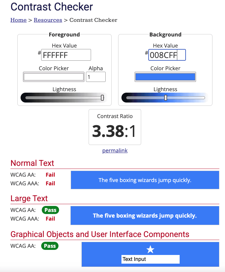
Evaluated any components that were utilizing either text, colour, or icons against WCAG accessibility standards.

USER INTERVIEWS
We conducted user interviews to empathize with the users and gain a deeper understanding of their pain points.
FINDINGS
183
Ul Components being used across platforms. Indicating high design and technical debt.
39
Type scales being used across platforms Indicating inconsistent typography styles.
51
hours/project spent on inefficient design and development cycles.
47%
of Ul components failed AA level compliance.
Component Evaluation & Refinement
SCOPE
Each component was evaluated to identify inconsistencies across platforms and within individual platforms. The evaluation also uncovered shortcomings in design consistency, accessibility, and UX patterns.
REFINEMENTS
1
Focus Areas: Color, typography, and spacing refinements.
2
Instance: Adjusted colour contrast ratios to meet WCAG AA standards, ensuring accessible designs across all use cases.
Creating a Central Visual System
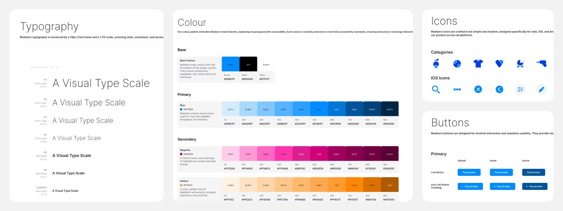
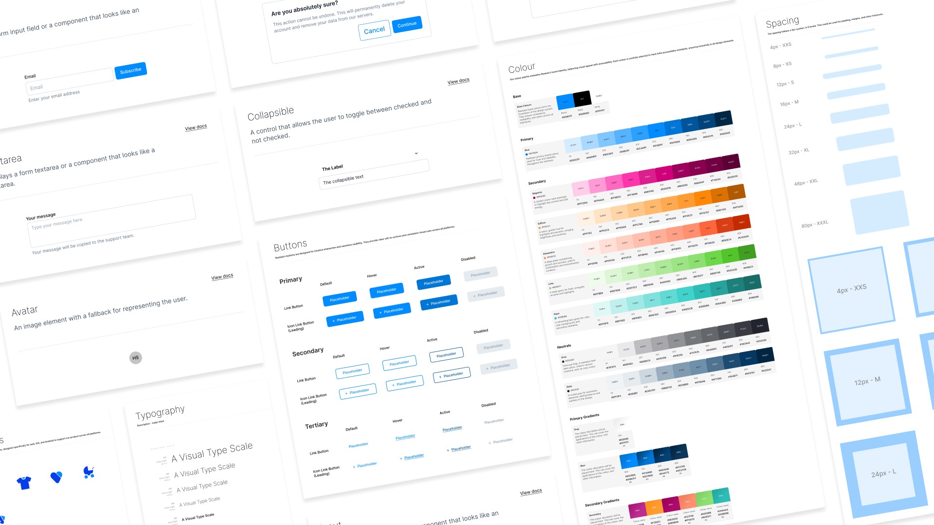
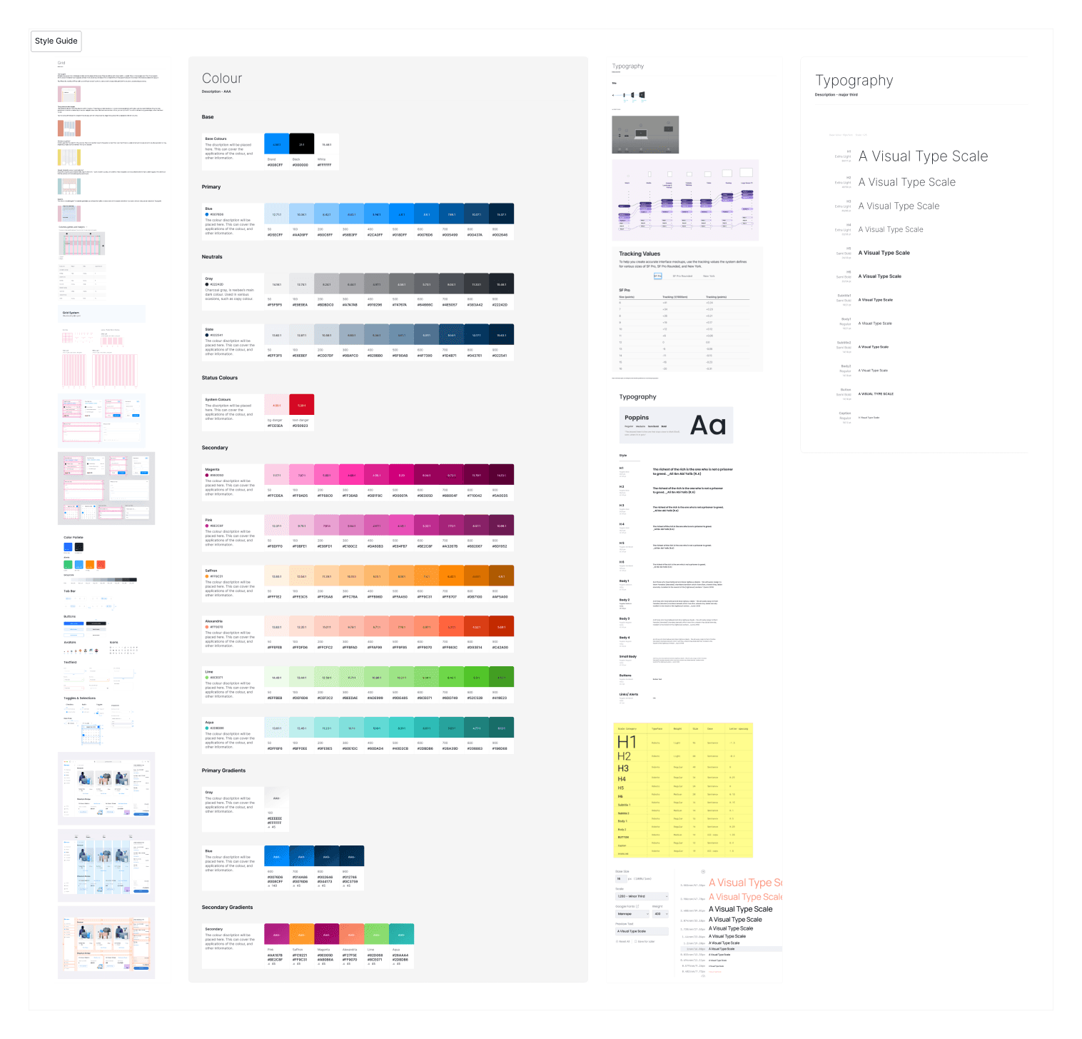
Based on the findings, I developed a centralized design system to unify design practices. This involved colour refinements introducing primary colour palettes, secondary colour palettes with ten shades each, and gradient palettes. Additionally, a refined typography system that included enhanced type scales, refined spacing systems, and a coherent iconography system. The entire design system adhered to AODA standards and achieved WCAG AA compliance.
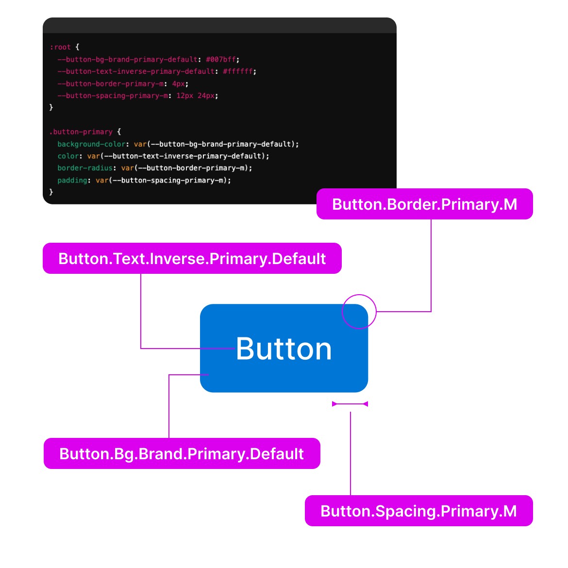
Moving to a Semantic System
Moving away from an atomic design approach, a semantic token system was employed. This transition allowed components to be defined by their roles and interactions rather than atomic properties, making the system more intuitive, scalable, and efficient for cross-platform use.
DESIGN TOKENS
The design system was built based on a token driven approach, standardizing design properties for scalability and consistency. Design tokens were categorized as:
Types: Bg, Text, Icon, Border, Space.
Color Roles: Brand, Component, Info, Assistive, Success, Danger, Warning, Disabled, Inverse.
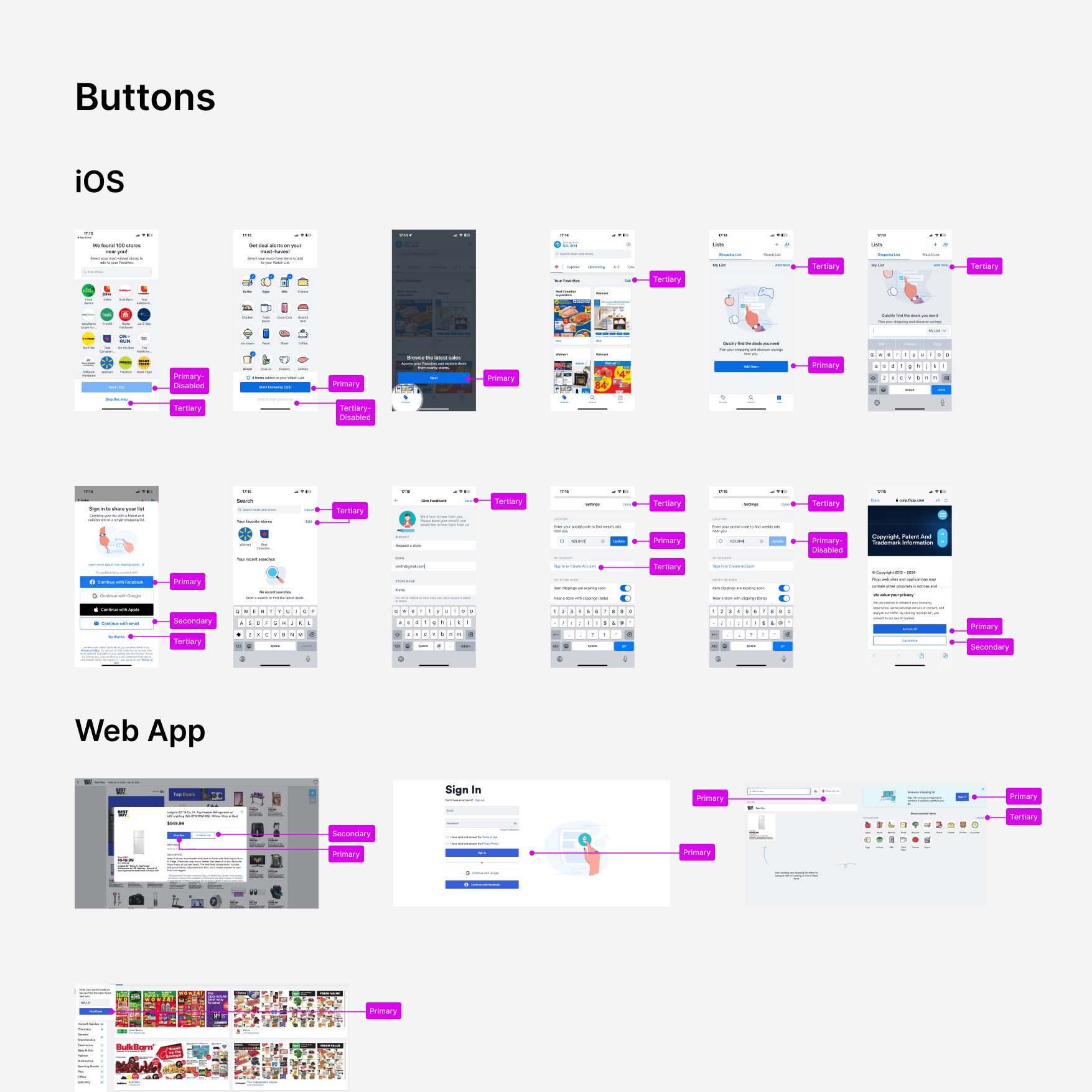
Prominence Levels: Primary, Secondary, Tertiary, S, M, L.
Interaction States: Default, Hover, Active.
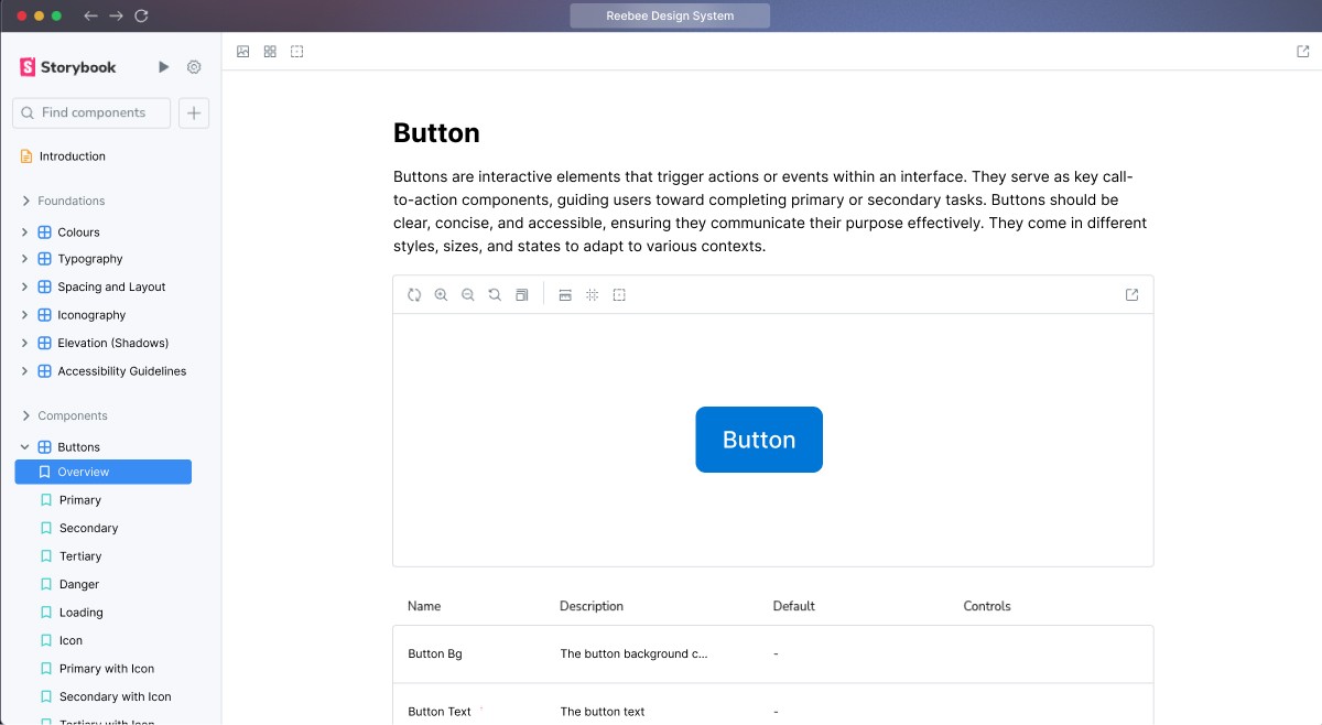
Documentation
Comprehensive documentation was included directly within the design system for easy access and context. Each component was documented with:
CLEAR DESCRIPTIONS
Explaining the purpose, functionality, and best practices for use.
VISUAL EXAMPLES
Accompanying images to illustrate correct usage.
GUIDELINES
Rules for when and how to use each component, including dos and don'ts.