CTA Optimization for
Enhanced Engagement
At DOZR, an online marketplace for renting construction equipment, I noticed low conversion rates on search pages, with users frequently bypassing the self-checkout process. As the lead designer, my role was to identify barriers to engagement, redefine the hierarchy of calls to action (CTAs), and ensure our design aligned with user needs and business goals. Collaborating closely with cross-functional teams, I conducted user research, usability testing, and iterative design improvements to address these changes.
USER ENGAGEMENT
26%
Increase in CTR
SELF CHECKOUT
11%
Increase in successful self checkout
SATISFACTION RATE
3.8
The CSAT rate improved
from 3.6 to 3.8
Timeline
ROLES
team
Product Manager
Engineer
tools
Discovery
To uncover the root cause of the low engagement, I used a mix of quantitative and qualitative research methods:
QUANTITATIVE ANALYSIS
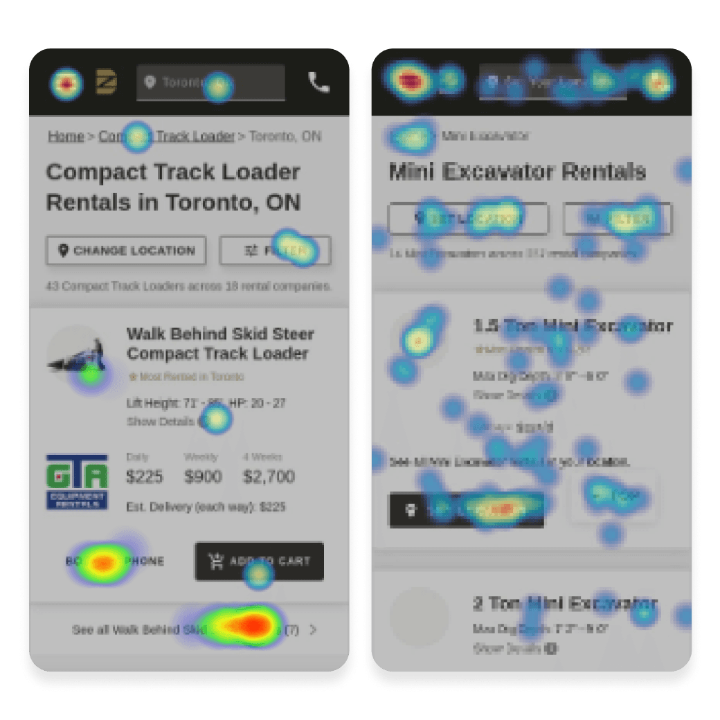
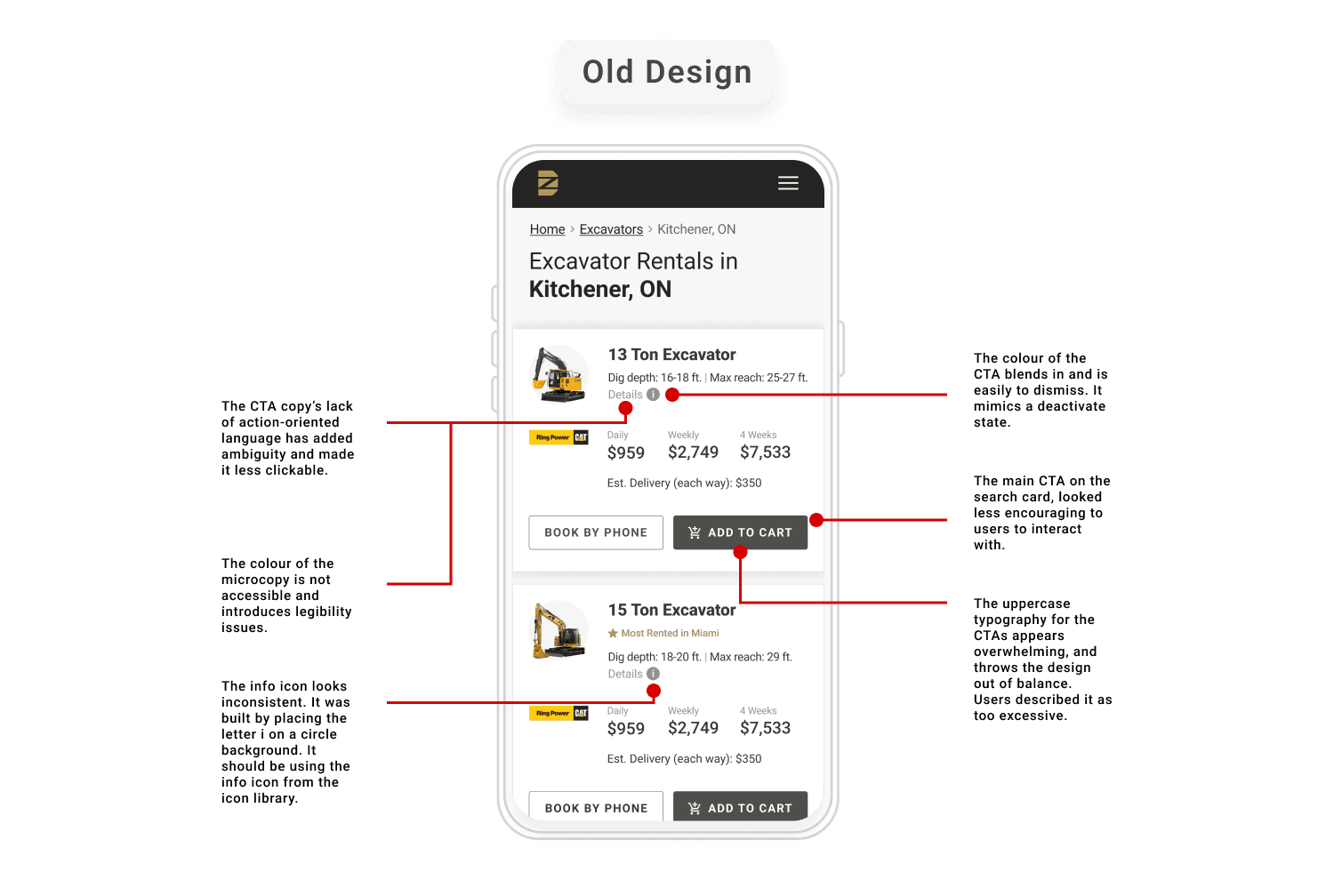
Analyzed heat-maps and session recordings, which revealed high bounce rates and limited interaction with self-checkout CTAs. The "Cal to Book" button had the highest CTR, suggesting users preferred direct contact.
SALES CALL SHADOWING
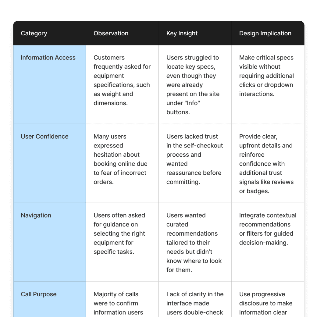
Shadowed 10 sales calls and identified recurring themes. Users frequently sought clarification on equipment specs and use cases-information already available on the search cards but hidden under an inconspicuous "Info" button.
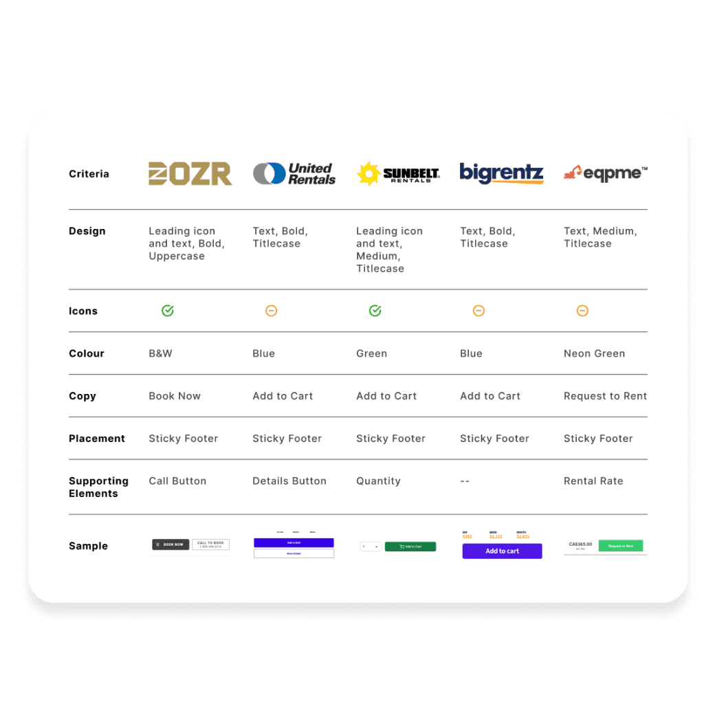
COMPETITIVE BENCHMARKING
Benchmarked competitors' designs and identified a pattern:
Users were used to visually distinct, industry-standard colours for CTAs, which DOZR's monochromatic approach lacked.
Early Stage Usability Testing
OVERVIEW
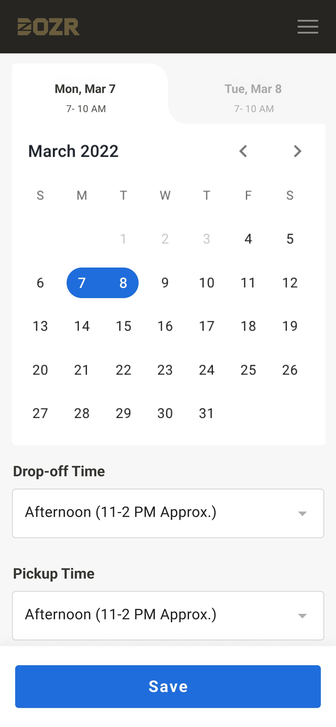
Testing revealed that users overlooked critical elements like the "Show Details" dropdown due to poor visual hierarchy, leading to confusion and frustration.
KEY INSIGHTS
1
Users didn't proceed to self-checkout as they were unable to discover critical information about the rental equipment (lack of visual hierarchy).
2
DOZR's monochromatic CTA design deviated from the user's mental model, limiting engagement.
3
Lack of discoverability on key information was leading to an increasing demand for ordering over phone calls.
Defining The Approach
The design challenge was reframed based on the findings of the discovery phase.
How might we improve the visibility and accessibility of CTAs to increase user confidence and drive engagement?
To address this, I facilitated brainstorming workshops with stakeholders, including PMs and developers, using:
• Affinity Mapping to prioritize user pain points.
• Mid-Fidelity Wireframes to explore potential solutions.
PRIMARY FOCUS
1
Establishing a dedicated colour for CTAs to create visual consistency and trust.
2
Enhancing the discoverability of critical information through visual hierarchy refinement.
3
Improving CTA typography to boost legibility and aesthetic appeal.
Design Validation
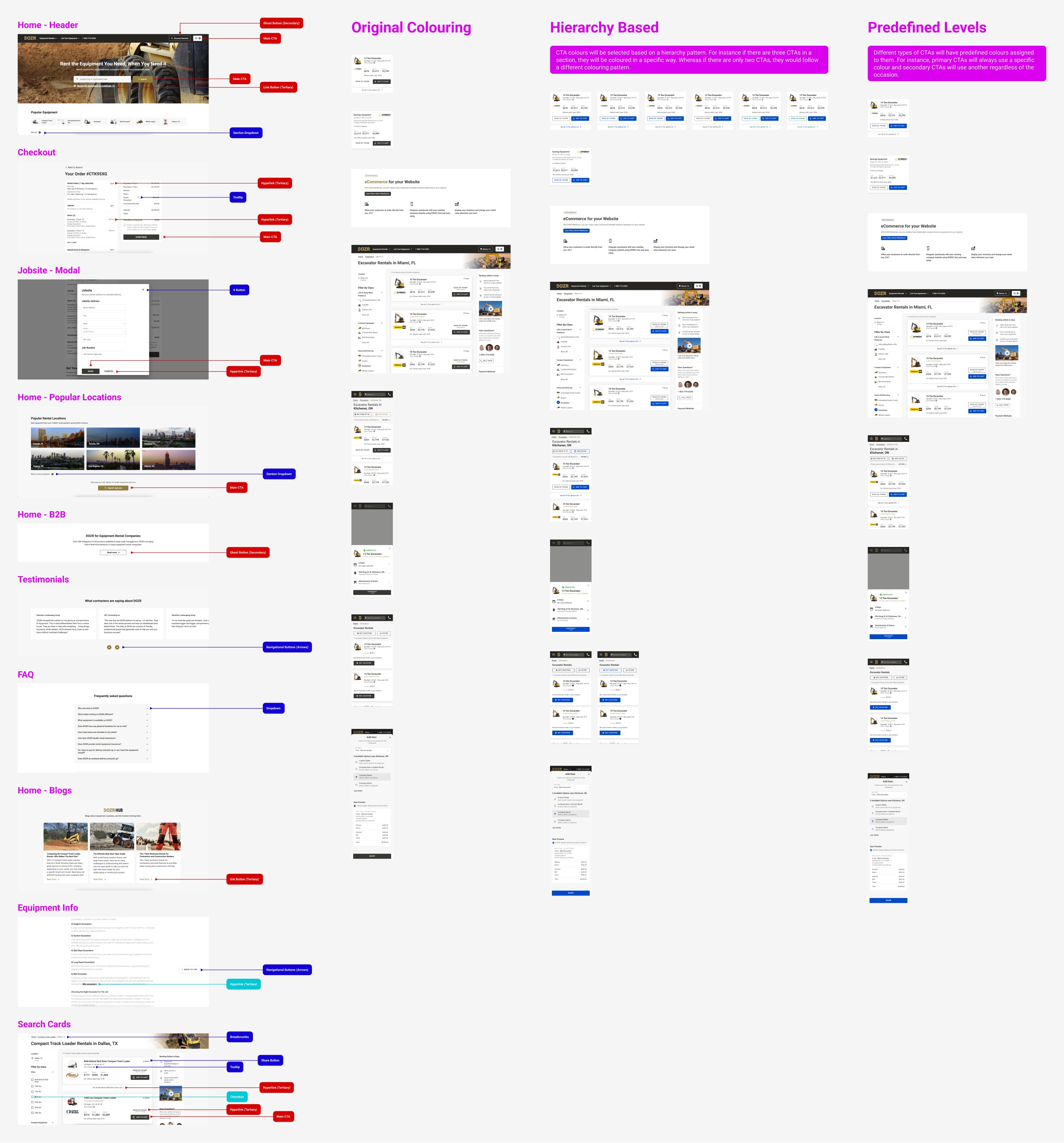
To better align with the user mental model, we explored a secondary colour palette that was easier to discover and was more accessible.
A/B TESTING
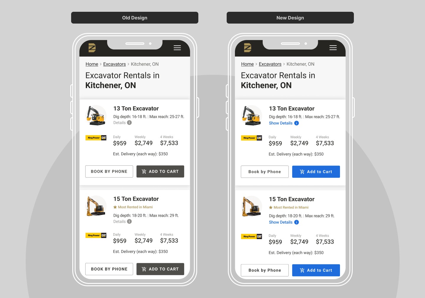
Ran an A/B test, comparing the old monochromatic design against the updated blue colour.
Results
30%
Increase in CTA click-through rates.
+70%
User engagement with the "Show Details" link.
Implementing The Solution
With the strategy defined, I moved into high-fidelity prototyping and system-wide updates:
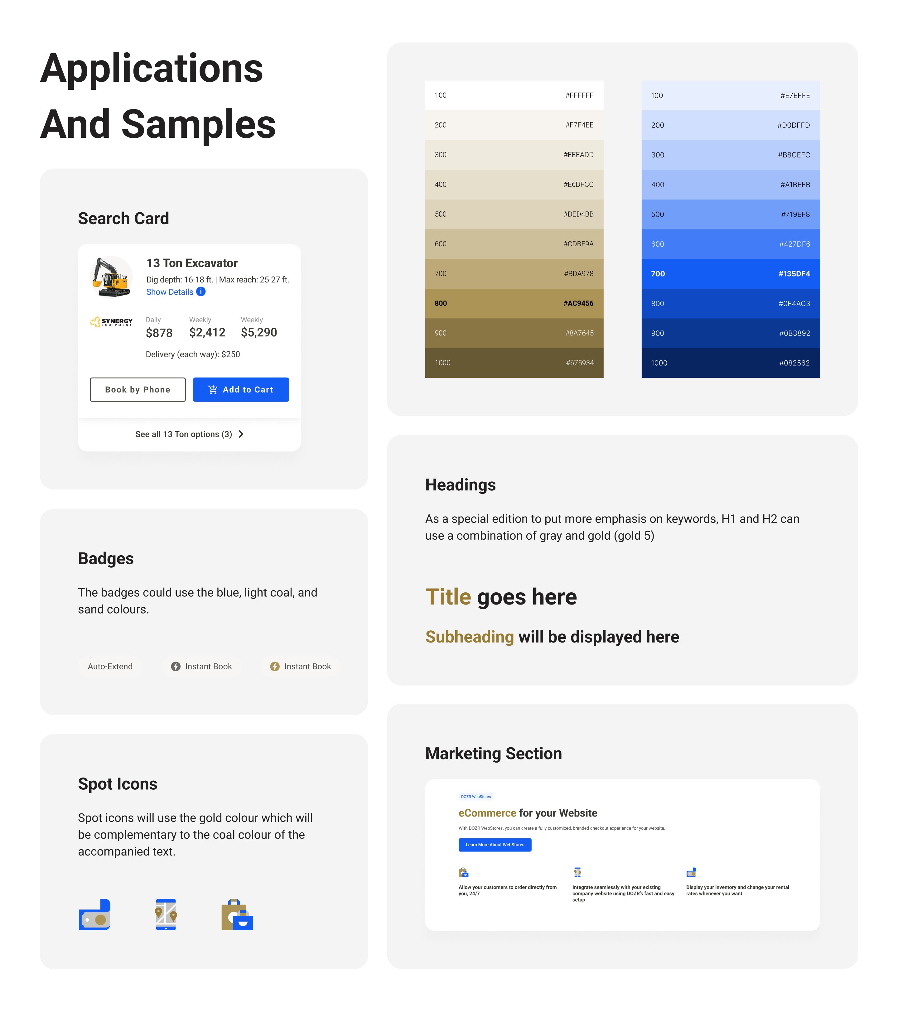
DESIGN SYSTEM UPDATE
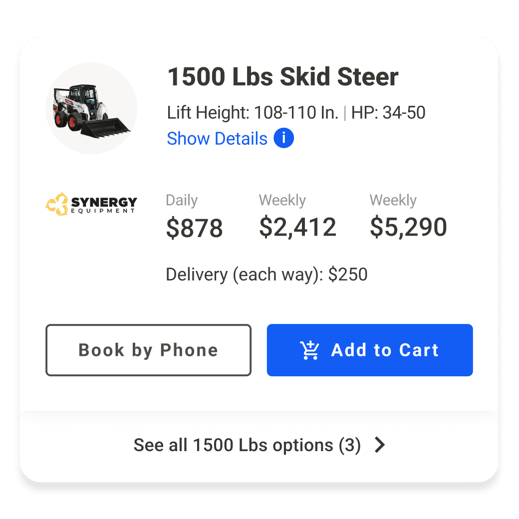
Introduced a dedicated blue hue for CTAs only, aligning with the user mental model and complying by AA accessibility standards.
Updated the design system to incorporate the new CTA colour and guidelines for consistent application across touchpoints.
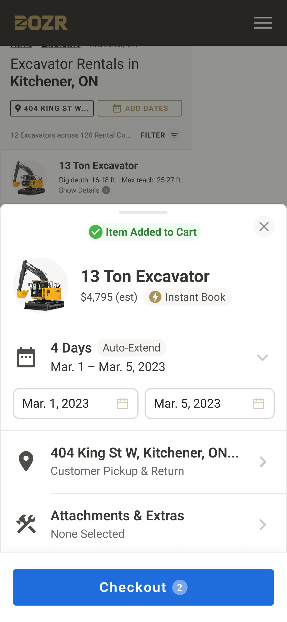
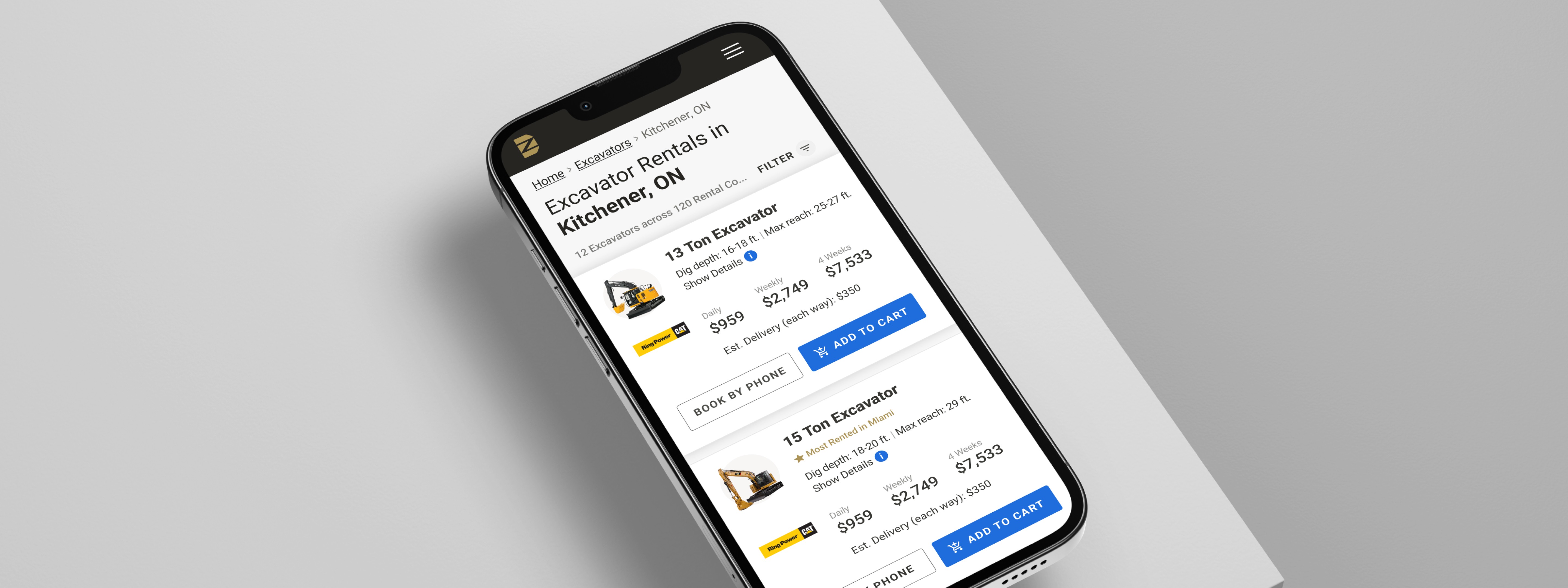
VISUAL HIERARCHY
Applied the new blue hue to the main two CTAs on the search cards:
"Show Details" link button
"Add to Cart" button
Also, increased the prominence of the "Book Now"
button on search cards by revising placement
and size.